
FormA11y
Making dense PDF forms accessible without expert-only tools
PDF forms are rarely born accessible. Before someone using a screen
reader can complete one, an author has to identify every field,
assign the right field type and bounds, group related controls, and
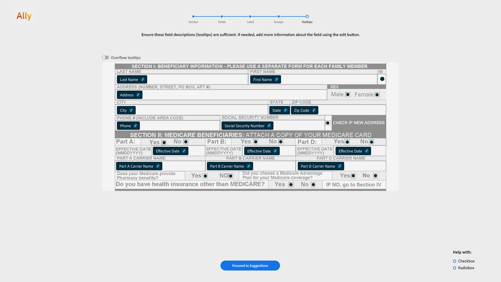
write useful labels and tooltips. Existing tools make that work
non-intuitive, repetitive, and overwhelming, especially when a form
contains hundreds of tightly packed elements.
FormA11y reframed remediation as a guided human-in-the-loop workflow. Machine-learning models produced a partially remediated starting point; the person reviewed fields, groups, and tooltips one layer at a time and corrected what the model missed. The aim was not to remove human judgment, but to spend it where it mattered.
Research
We interviewed two PDF-remediation specialists with more than seven
and ten years of experience, reviewed WCAG guidance, and audited
accessible government forms. The same three problems kept appearing:
the workflow demanded specialized knowledge, repeated the same
actions across every field, and forced people to hold too much visual
information in their attention at once.
We then ran 20 pilot tests across low-fidelity Figma concepts and a working React prototype. At least two people tested each minor iteration, and four people completed an end-to-end pilot of the final study protocol. Those sessions moved the design from broad flows to granular interactions such as drawing a field, changing its type, grouping controls, and linking OCR text to a tooltip.
Iterations
There were many more concepts than the final paper could foreground.
These are two of the larger directions we explored while trying to
balance guidance, cognitive load, and the amount of repetitive
review a person still had to do.
Iteration 1 · Auto-move
The flow began with active learning: FormA11y surfaced the fields in
which the model had low confidence and asked the person to correct
them first. It then moved through every field automatically. The
person could pause or flag problems with bounds, type, grouping, or
labels, remediate those exceptions, and use the corrections to
improve suggestions elsewhere in the form.
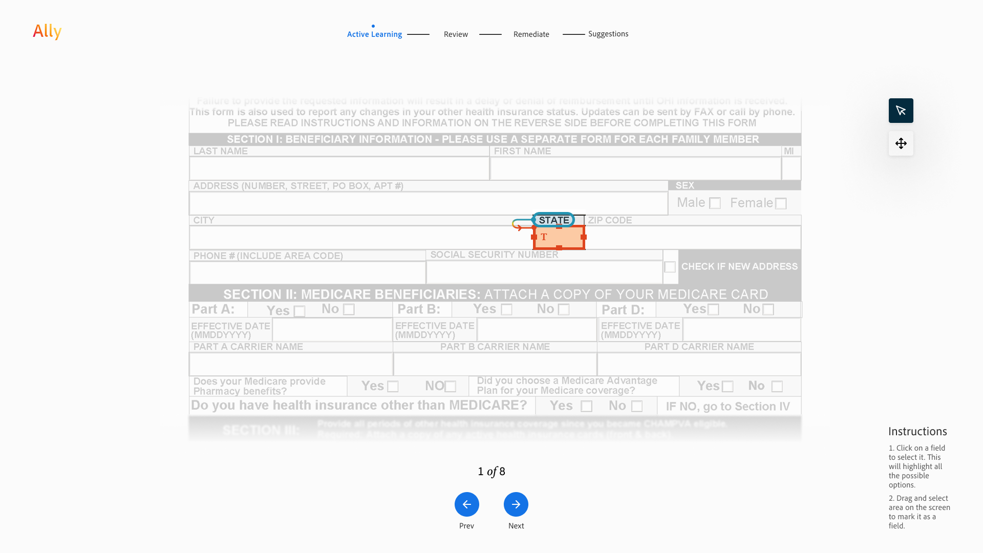
Start with uncertainty
Dimming the rest of the page focused attention on one model output at
a time, with a simple count showing how much uncertain work remained.
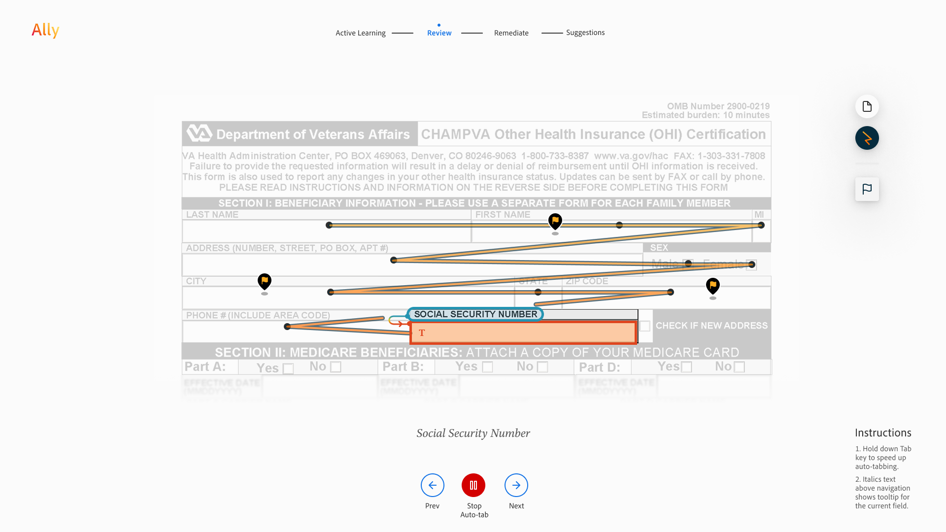
Review without losing your place
Auto-move advanced through the form field by field. People could stop
the sequence, move backward or forward, and flag an issue without
having to remember which fields they had already checked.
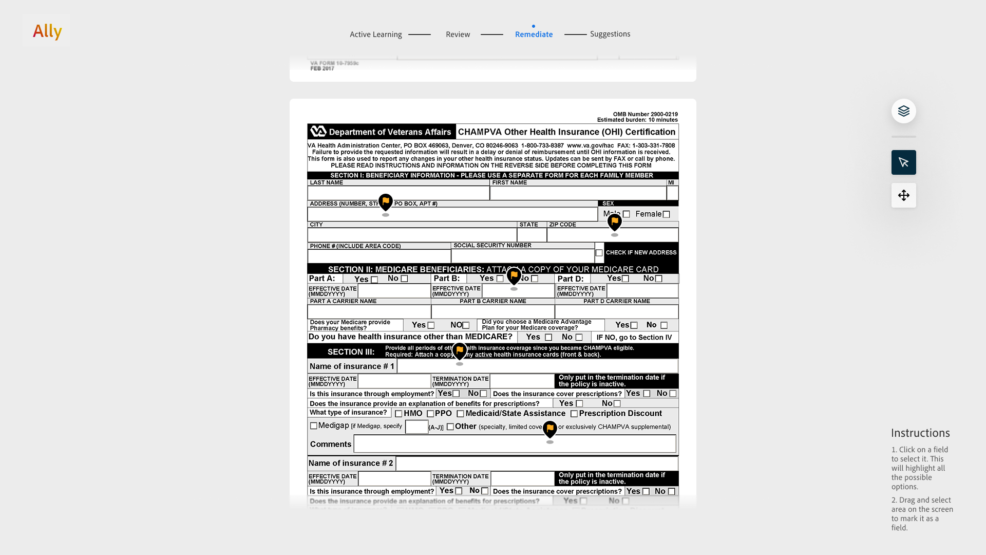
Collect exceptions, then fix them
The remediation step gathered flagged items into a focused queue, so
review and correction were separate modes instead of one constantly
shifting task.
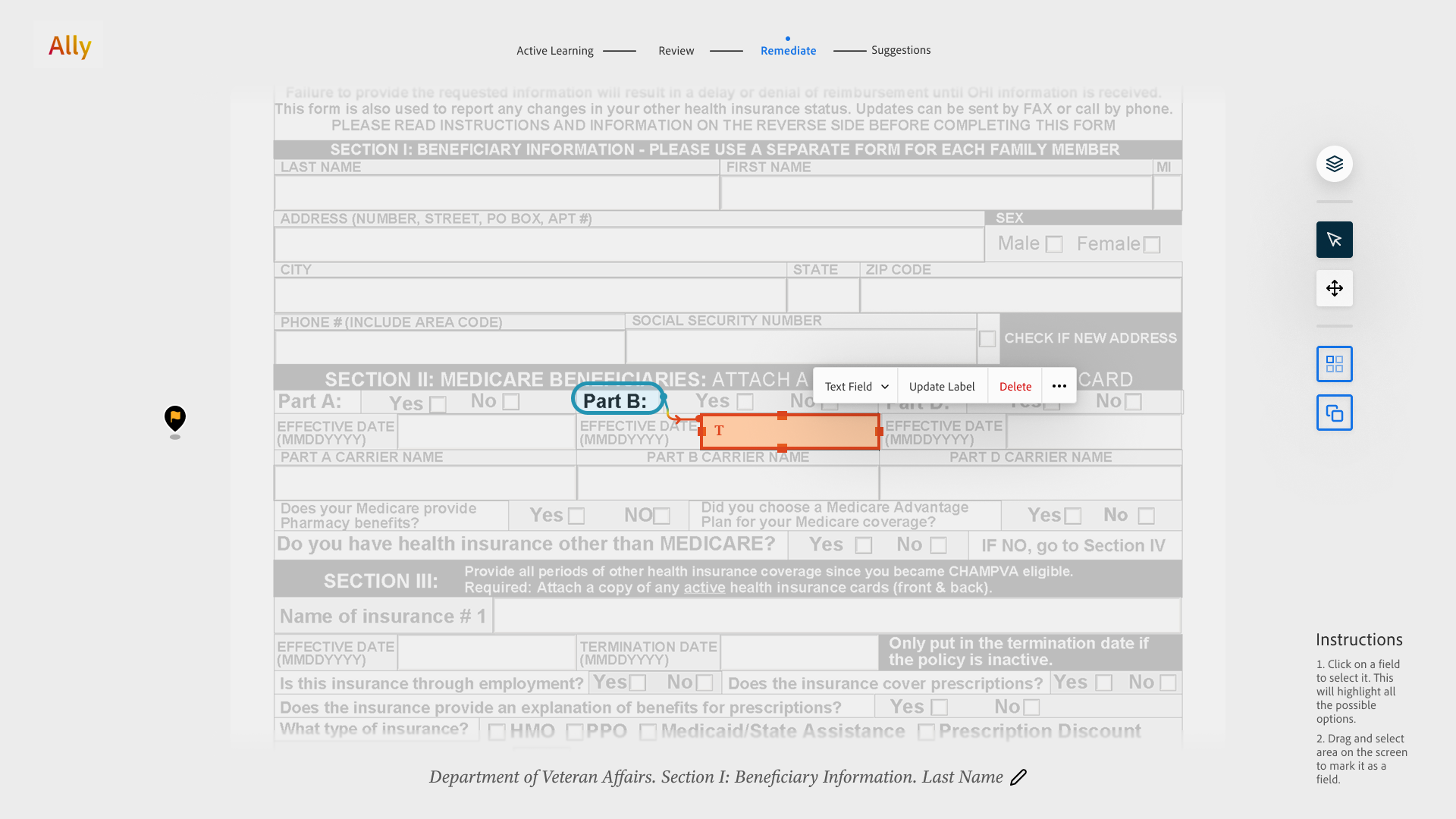
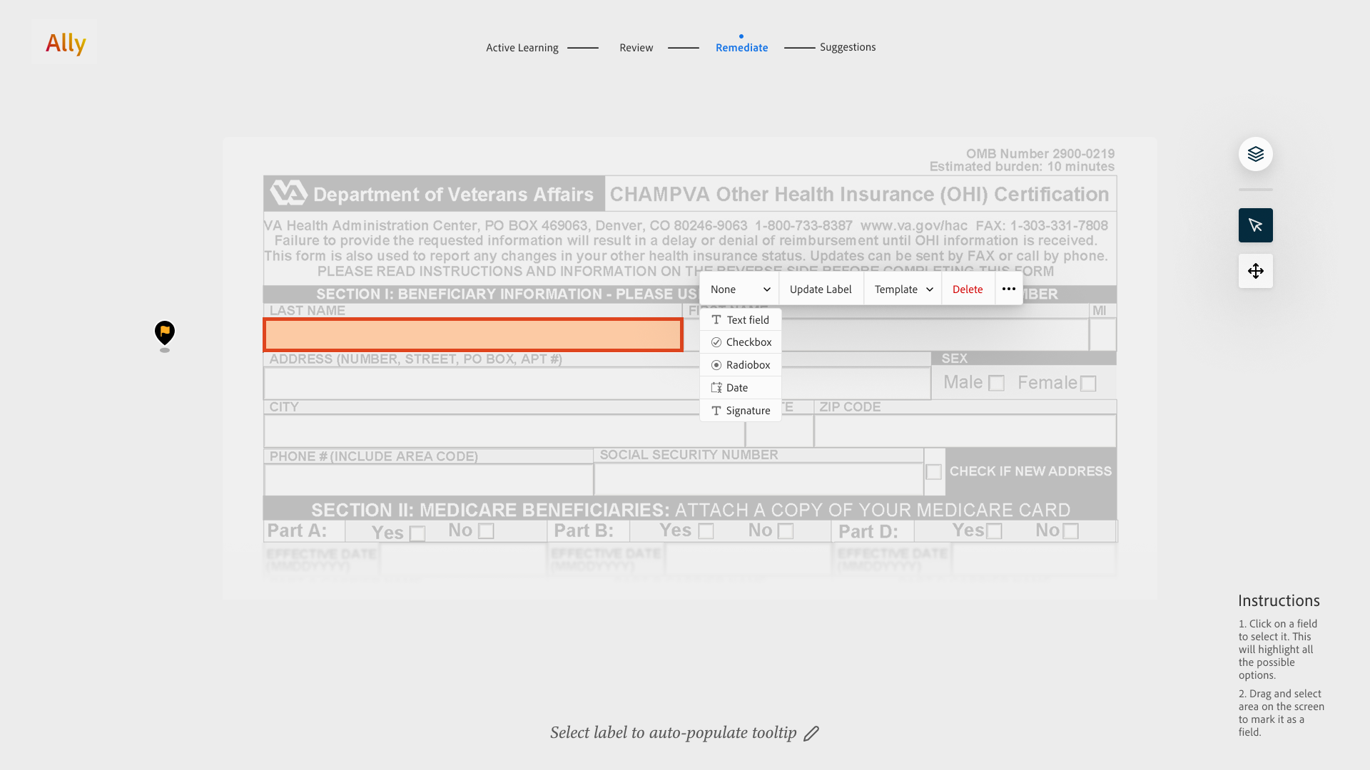
Correct in context
A floating toolbar kept common fixes next to the selected field:
resize its bounds, change its type, update the label, or delete it.
The concept had strong wayfinding, but moving through every field
could still feel long on a dense form.
Iteration 2 · Sections
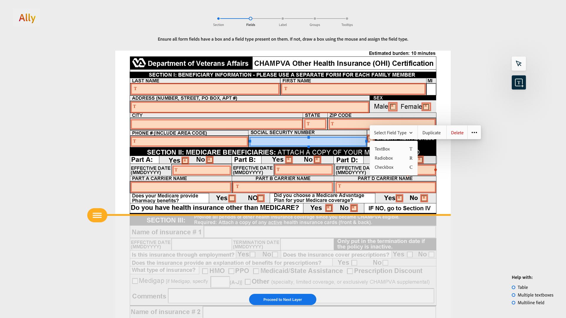
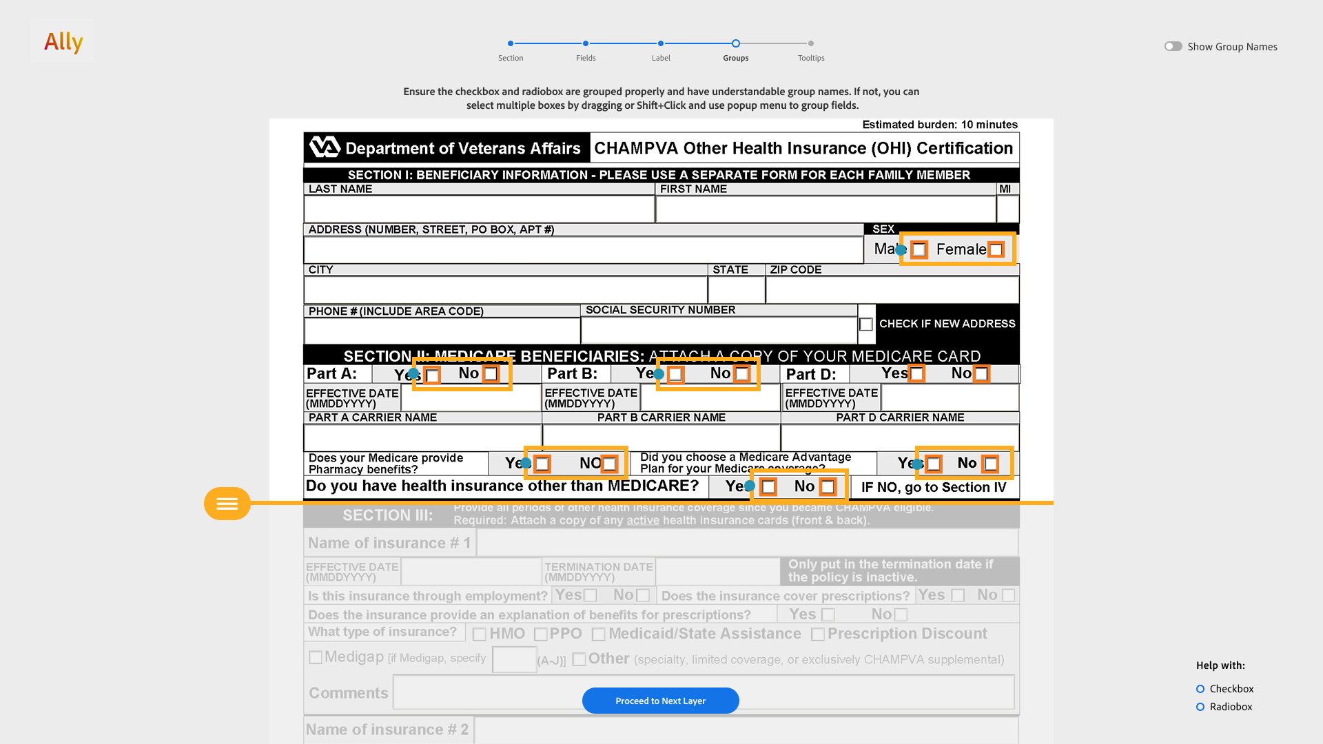
The next direction reduced scope. A person selected one horizontal
section and reviewed its fields, groups, labels, and tooltips before
moving on. The hypothesis was that a smaller working area would make
dense forms less overwhelming, while corrections from each section
would improve model suggestions and leave fewer errors later.
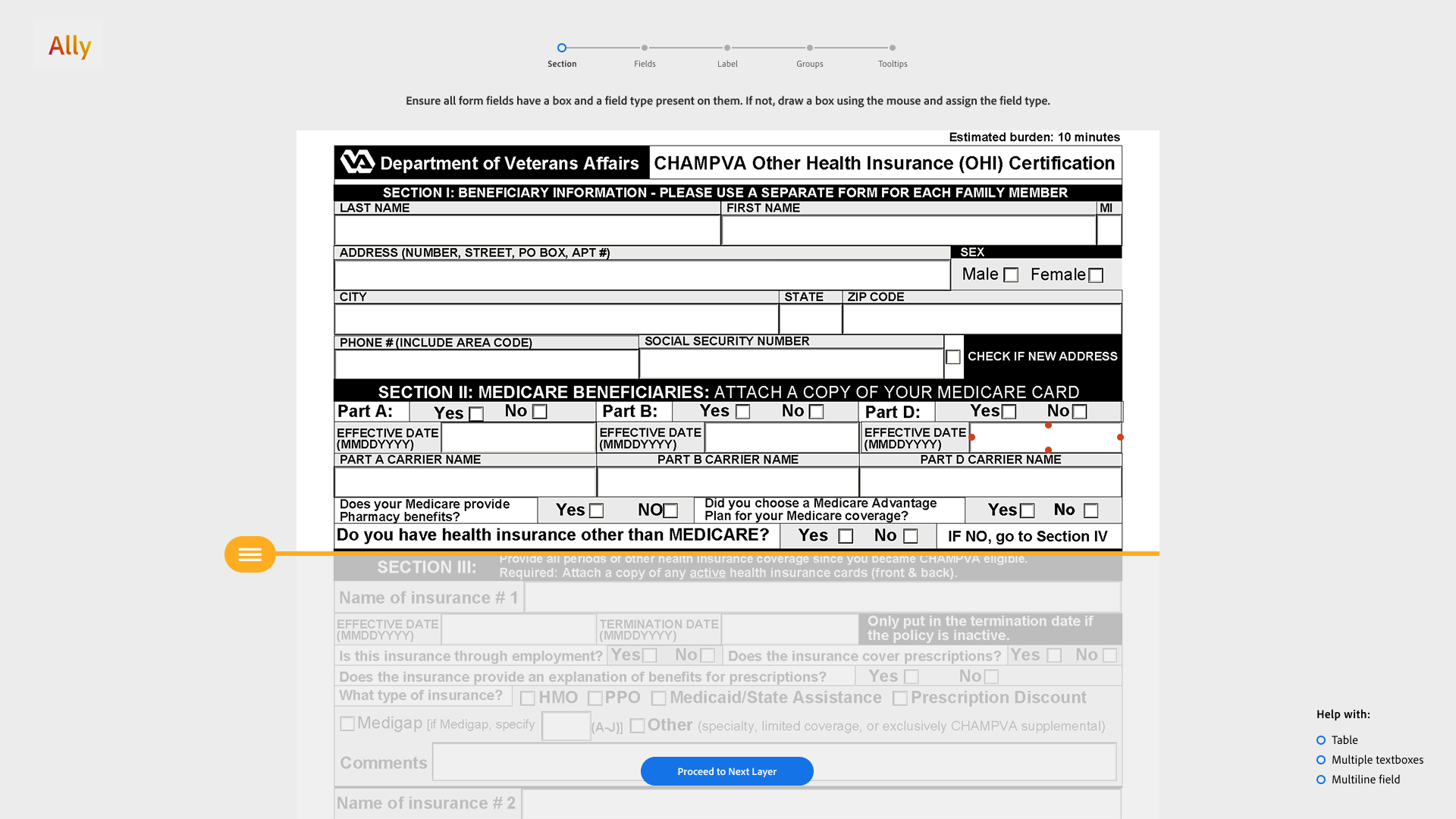
Constrain the working area
Only the selected slice stayed interactive; content above and below
was muted to prevent accidental changes and reduce the visual field.
The learning
The layered review was valuable, but the section metaphor was not.
In pilots with three people, participants struggled to form a
consistent mental model, often drew page-height sections, and felt
that repeatedly defining a region and pressing “next” added work.
We removed sections and kept the stronger idea: show only the layer
relevant to the task at hand.
User study and results
The final evaluation was a counterbalanced within-subject study with
20 participants: 4 experienced PDF-form remediators and 16 novices.
Everyone used both FormA11y and Adobe Acrobat Pro on two government
forms matched for difficulty and error count; half started with each
tool to control for learning effects. We measured completion time,
remaining accessibility errors, task difficulty, confidence, and
System Usability Scale scores.
- 2.8×
- faster than Acrobat
- 82.4%
- fewer remediation errors
- 83.4
- SUS score, vs 45.6
Participants completed the work in 41% of the time required in Acrobat: a mean of 12:55 versus 31:29. All 20 finished within the time limit in FormA11y, compared with 70% in Acrobat. They also left significantly fewer errors across fields, groups, and tooltips. The time difference was significant (two-tailed unequal-variance t-test, p = 6.54 × 10⁻⁹); Wilcoxon signed-rank tests were also significant for fields and tooltips (p = 0.0002) and groups (p = 0.0003).
Final prototype walkthrough
The video documents the complete research and final workflow. This
prototype was a research instrument built to survive real user
studies, not a visual-design endpoint. While designing the system, I
also wrote the working prototype by hand, ran the studies, analyzed
the data, and led the paper. I prioritized reliable interactions and
research validity over the final layer of visual polish.
Sparsh Paliwal · 2025